
TLDR
Homeowners who love to be creative with their home finishing ideas might want to choose a color to go with orange. A more neutral palette might be preferred; however, you can still play around with your color wheel.
If you have a bright orange color, less shiny colors will be preferred. Finally, you might want to select the exact portion of the house you’d like to add orange. It is preferred in the children’s room; however, that is another topic.
Read through the entire article to get the full context and complete information given for free here on steadytips.com.
What to Expect
Homeowners who are looking to toy around with the color orange will get tips and tricks to
How to Choose Colors That Go With Orange
Would you like to choose colors that go with orange? You don’t need to stress, we have done the digging for you. Just go on with this article
Color To Go With Orange (Color Palettes/Combinations)
Have you ever tried to use the color wheel to beautify your home? Do you love orange? If you do, it is best you stay with us here because we have several combinations that go with orange that you can try.
First, let’s talk about how to choose colors that go with orange.
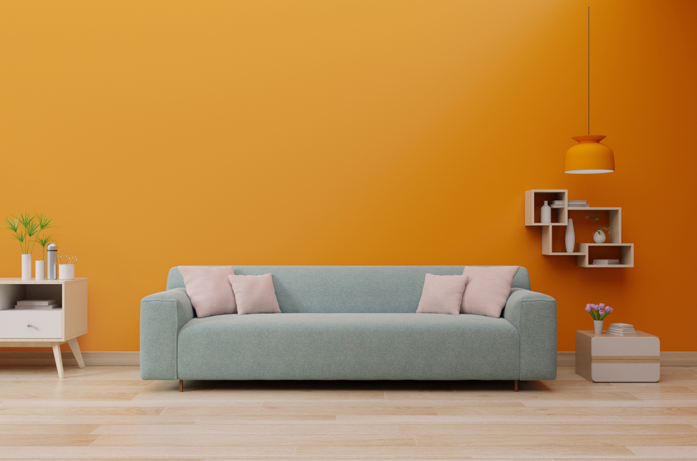
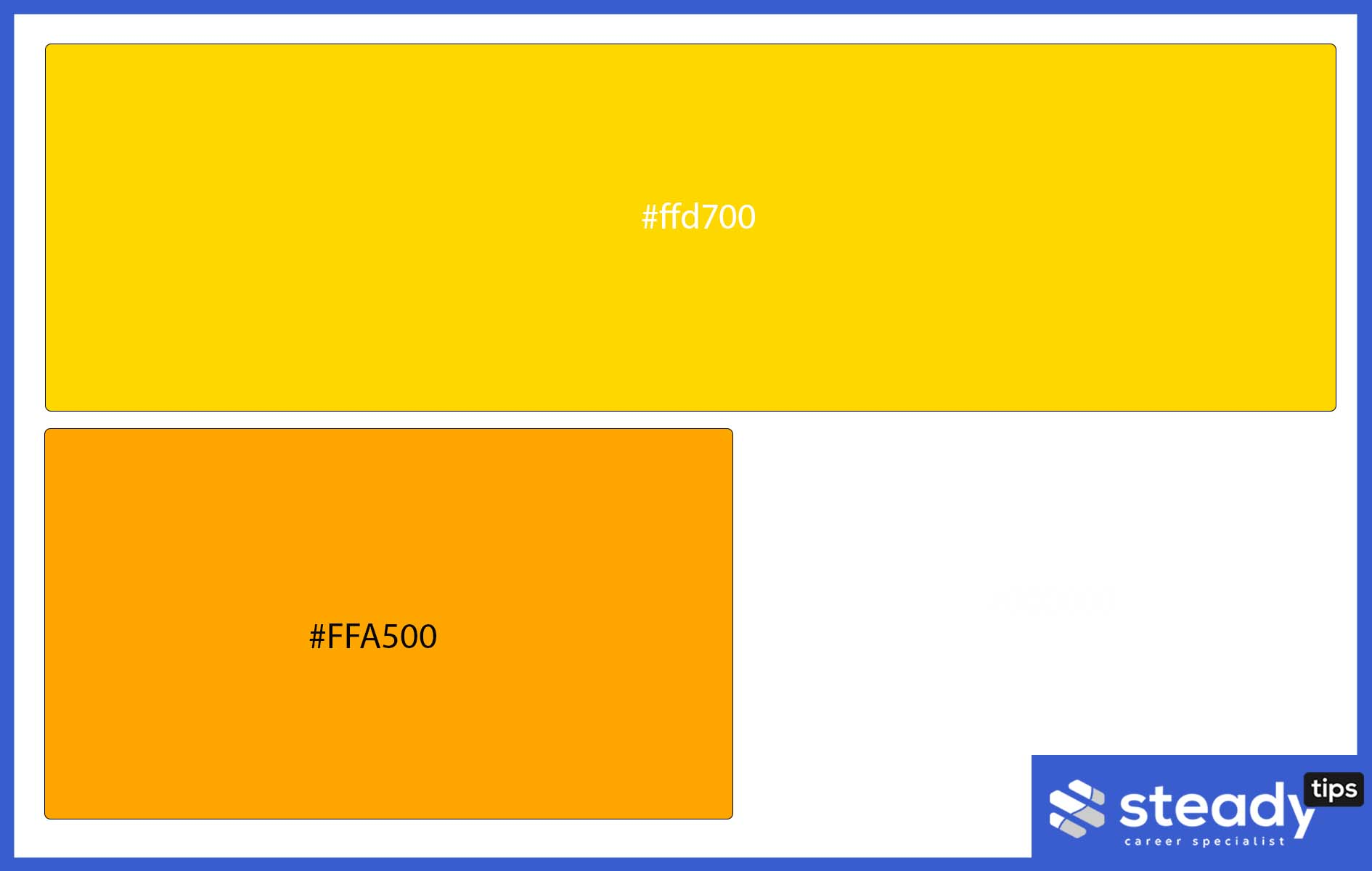
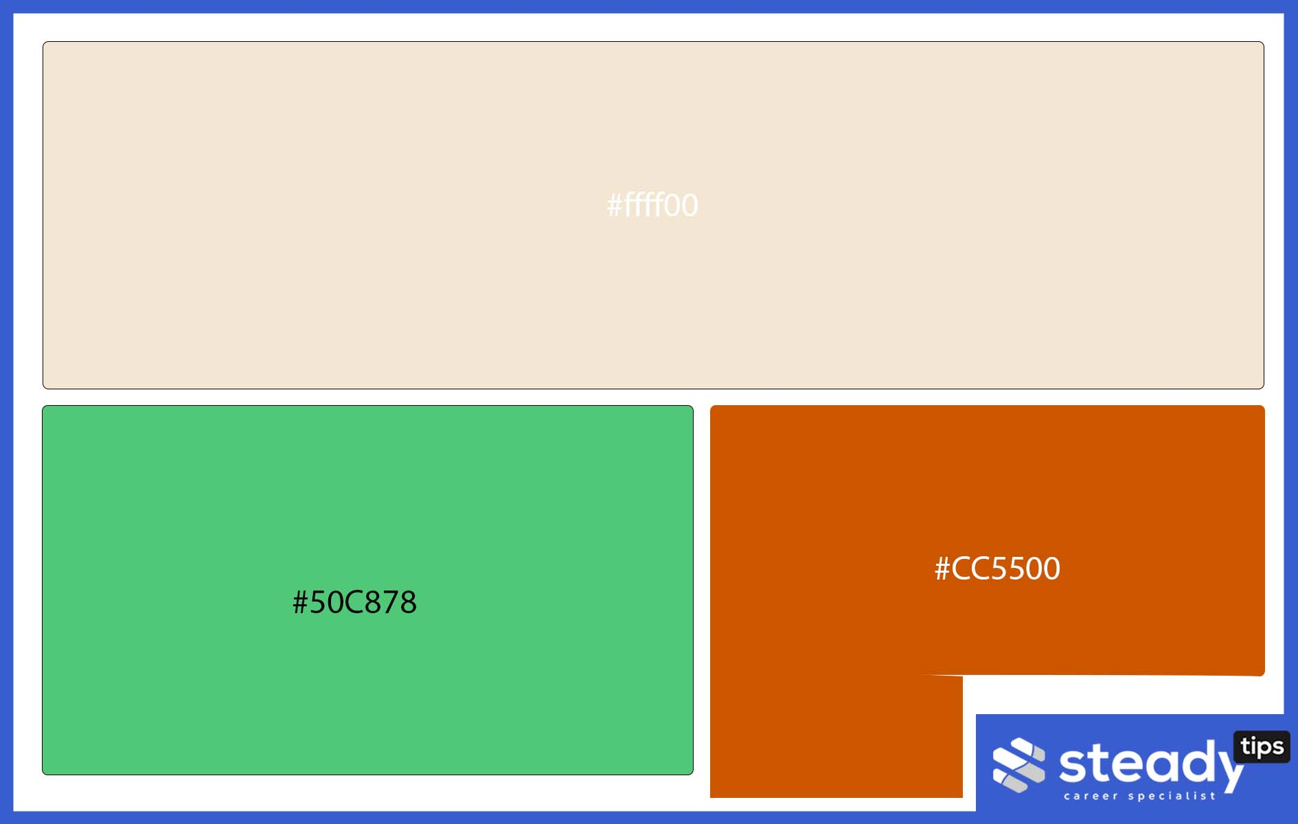
Orange + Yellow + Blue
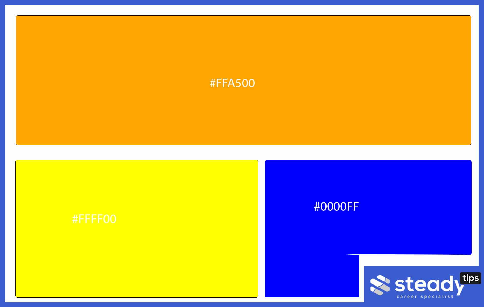
Are you setting up your home, and you need a color to pick for your kids’ room and playhouses, or are you trying to set up your kitchen in a colorful way? These color combinations may be the right thing to pick out.
Artistically speaking, when picking an orange color scheme, you can choose to go for orange walls, bright orange flowers, a blue couch, and muted orange accent walls. The possibilities with these complementary colors are endless.
Do forget to take it easy with the vibrant orange. Remember, bright colors make children hyperactive, so you might want to put that into consideration.
Blue and orange can be used in many ways. This depends on the type of blue you’d prefer. I have a personal preference for pale blue, navy blue, and sky blue. Try the blue and orange combination if you don’t like the yellow, blue, and orange combination.
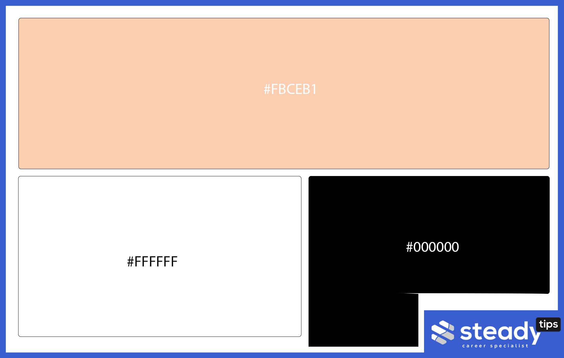
Neutrals and Orange
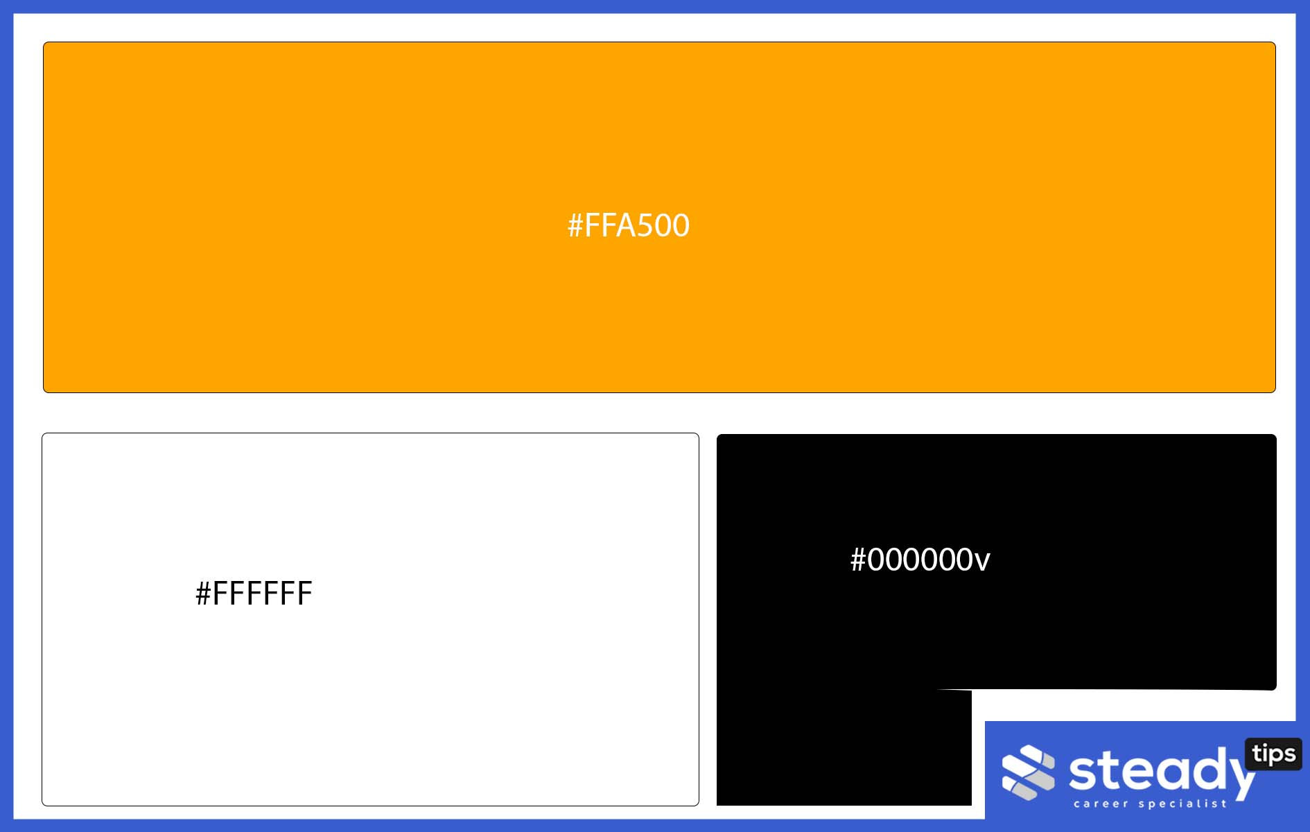
You might be wondering, but black is not a color, it is the absence of color.
If you asked this, then you certainly know your colors. Black may not necessarily be a color, but it is a color that everybody knows can go with anything. You basically cannot go wrong with either white or black. A black couch and white walls can definitely go with an orange TV mount setup deco.
You can also consider giving your kids an orange room.
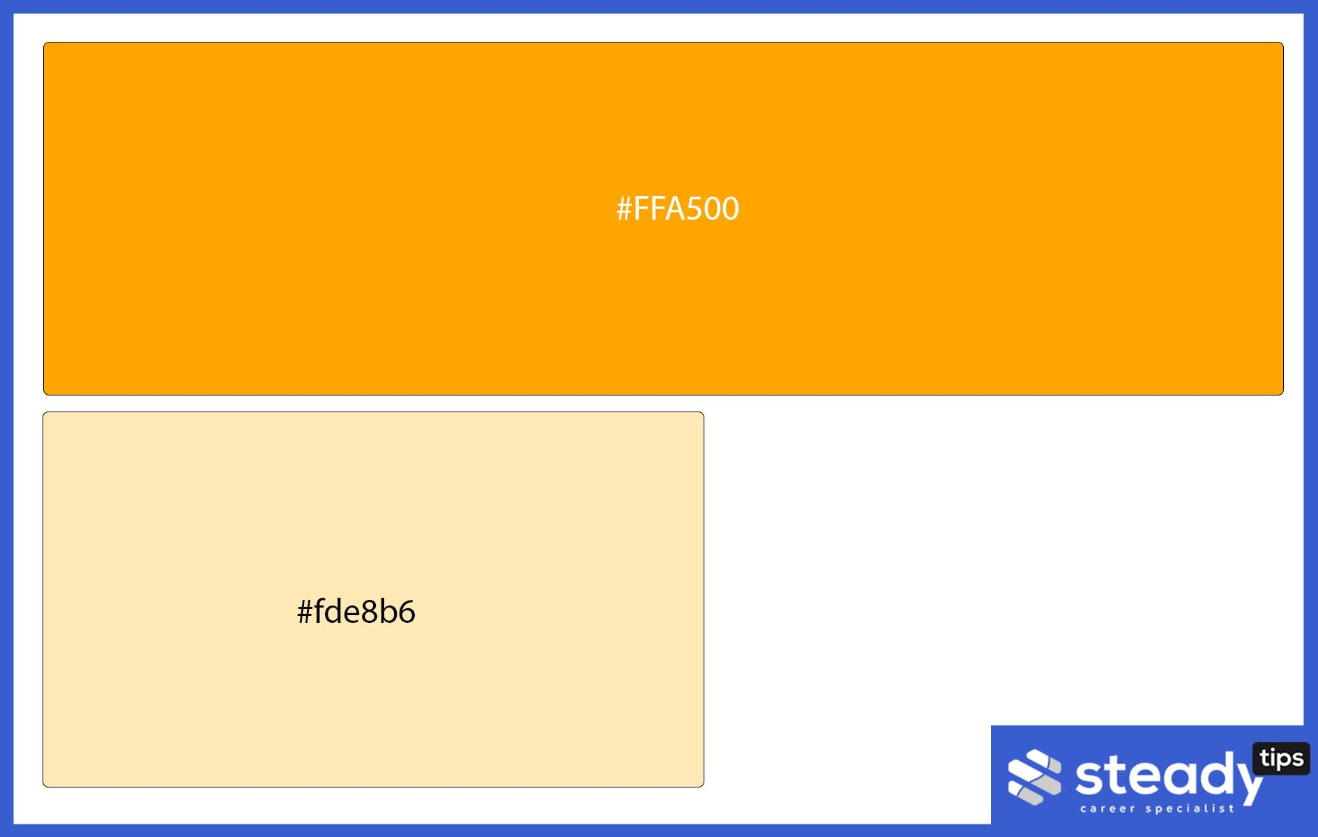
Shades of Orange + White
Pairing an orange dining set with white walls is a combination that can definitely be worked with. You can also utilize different shades of orange to give that excellent finishing effect.
White is considered a neutral color, allowing users to use any equally bright colors for items and the room or any other color of their choice. One has to be also careful to understand color combinations before making specific decisions about the kinds and colors of items that will eventually be found in the home.
Above, you can conceptualize a simple setting by pairing orange and an accent wall. The combination looks great and classy. Amazing, isn’t it? A bold orange couch goes with a white background on the walls.
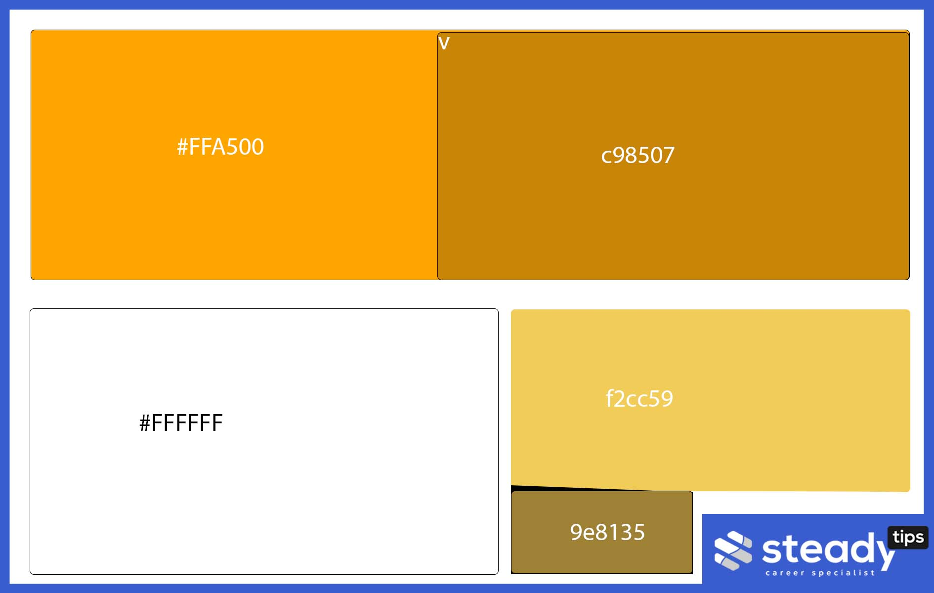
Cool Gray and Orange
If you like experimenting with orange color combinations, this might be the right combination for you. Cool grey and orange can be used in a variety of ways.
Quick advice for your interior designer, orange with a yellowish undertone can be a great color to play around with. It may not be so great on wood floors, but it can be used ideally for an accent wall or a couch.
Dusty rose might not be the wrong color to add to this combination; however, you’ve got to take it easy with the ash and its usage.
Did you think that color combination may not be right for you? Why not take a look at this setting? If this still doesn’t tickle your fancy, there are still a whole lot of other complementary color wheel combinations that we can suggest here.
Stick around for more.
Tangerine + Ebony + Cream
Why not try a bold tangerine and cream or ebony? Sounds weird? Well, not until you try a cream or tangerine mixture. That bright feel it lets out can be watered down by a touch of ebony.
I personally have a flare for ebony as a color. This post will be updated as soon as we can find the best use of this combination. Maybe trying patterned curtains or a patterned wallpaper with ebony and a touch of cream. Sounds like something I would like to try.
Red-Orange + Indigo + Bright White
Red-orange is a non-bright color that can be combined with white and indigo. The indigo can serve perfectly for patterned curtains, bright white walls will look good on that, and an indigo couch or frames for pictures.
This patterned wallpaper perfectly uses the Red-orange, indigo, and bright white combination. It is perfect for a TV background setup, but it wouldn’t be ideal if you were to choose to place it around your entire apartment. Regardless, it’s a great combination.
Fiery Orange + Fuchsia + Dusty Rose
Trying out various shades of orange is always exciting. This particular combination looks nice in theory; however, I’m yet to find an exact use for it within the context of this topic. I’ll definitely update this article as soon as I do (I’ll keep a look out for wallpapers with this color combination.
I have tried experimenting with a dusty rose and Fuchsia combination, the only thing missing was the fiery orange. But I’ll do well to get you something visual for this purpose soon enough.
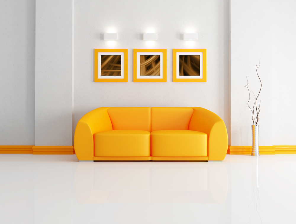
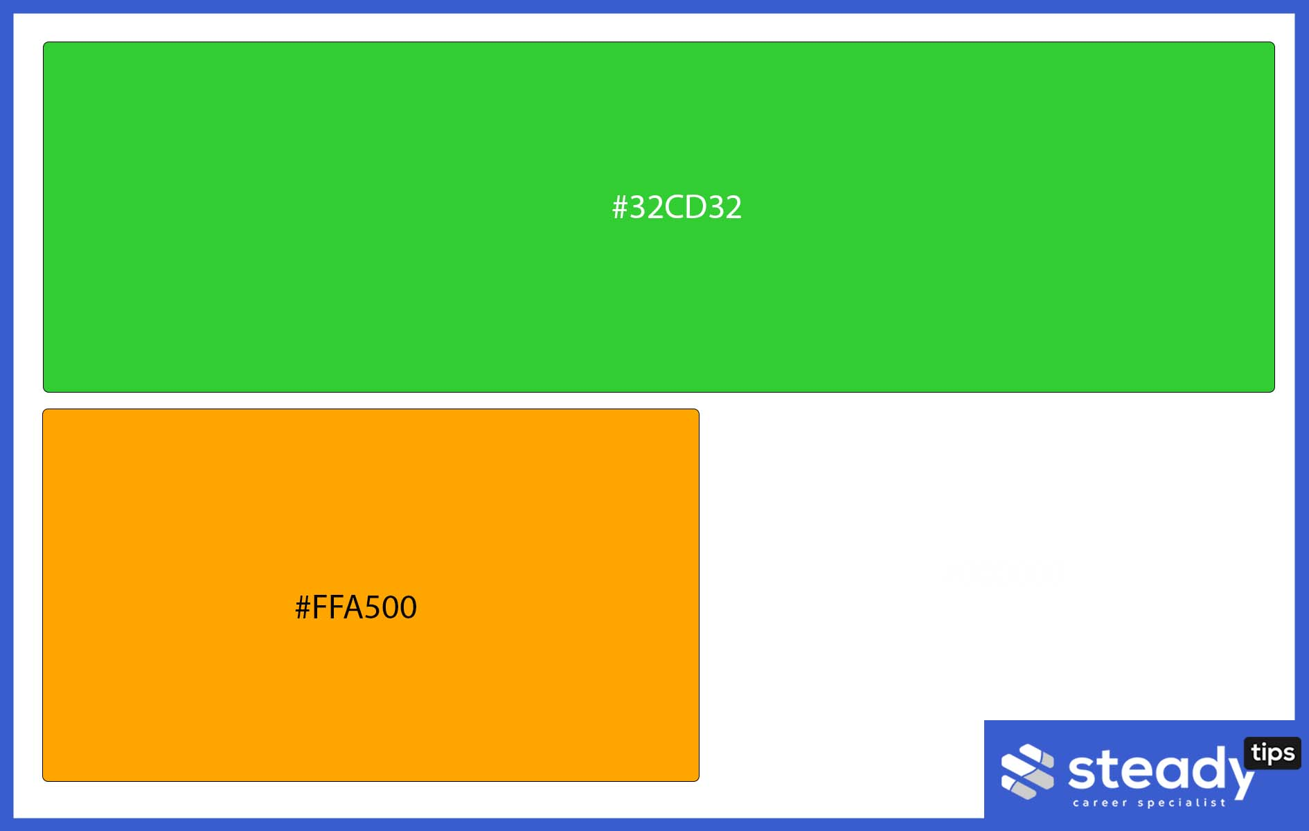
Orange + Green + White
Does this look disturbing to the eyes? Well, at first, it certainly does but wait until you see it in use. Green always serves excellent for grass and other kinds of plants. Any kind of green goes for me in this regard. Carpet grass is another example you can’t look away from. It’s interesting when used for decoration.
Orange will definitely always bring out the beauty in the green and other colors that may not be 100% appealing to the eyes when used in isolation for specific objects. Take a look at the sample below to see the perfect use of the orange, green, and white combination.
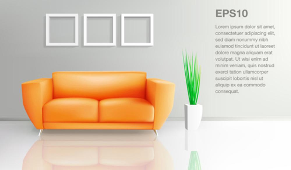
In the image above, even warm browns can do the trick. You have a bright orange couch, a white vase, a green synthetic plant to spice things up, and a background that has white frames for your pictures.
Ignore the write-ups in this image, I just needed to get an illustration for this color combination, and this was just perfect.
Orange + Creamy White
Want a practical use for some orange tones? This combination can be used to get a nice gradient effect if you’re looking to combine colors, especially on wallpapers and picture frames. However, orange will always do you better. There are many more uses for this combination.
You can always try out creamy white walls, an orange couch, and any other combination you’d like. I’d personally try a black with this combination – very sleek!

Depending on the kind of paint you’d like, this gradient can be used by carefully stoking your brush on the orange background with creamy white paint for the topping.
Creamy white mainly looks like different shades of orange; definitely a brighter shade and can be used for a variety of things. A great example is your living room wall. Just don’t try hot pink in your living room… haha.
Come to think of it, I might just do that!
Burnt Orange + Brown
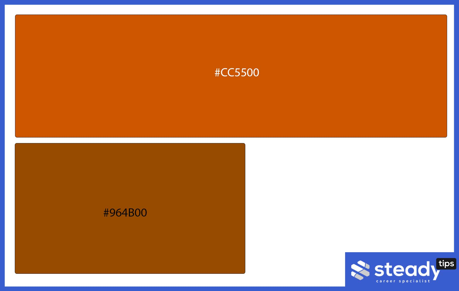
Bright orange may not be your thing, but how about you try out burnt orange? I wouldn’t recommend it for the living room walls, but using it on your tiles, wooden railings, or floor will be tactically correct.
Imagine your floor matching with your burnt sienna? I mean the color of your car… I’m sure you get the point. Anyways, your dining room tables will thank you for a burnt orange finish.
Orange + Mustard + Teal
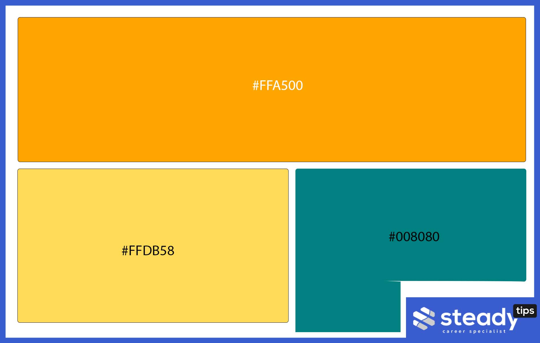
I personally love a creative color wheel, and pale orange isn’t always the first color on my mind. In place of orange, I’ll pick a mustard color any day. Adding that with a teal combination gives it that vivid shade I’d love to see on a wall. Send me an image of this if you have it. I’d love to see this combination in action. I currently have only an image of wallpaper for it. Anyways here it is.
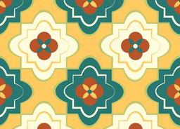
I couldn’t get a better image, but I was able to get this. Hope it makes up. If I’m able to get something better, I’ll update this post.
Apricot + Black + White
This one is a pretty simple color wheel scheme to use in your home, either in your living room or your entire house. The Apricot may not be orange, but it sure looks to me like a very light shade of orange. But hey, this is a personal opinion, I may be wrong.
Black, to me, is the complementary color, while white serves as that default color palette. You can always use
Orange + Gold
The gold wall or curtain can go with orange as your house’s underlying frame color scheme. Does it look good? Yes! But you might need to add a neutral color to your mix to balance things out. But you can’t go wrong with a gold and orange mix.
Lime Green and Orange
This color combination has almost been treated earlier, but this is quite different. Orange can always go for a couch, while you have lime green as part of the decorations of the home.
It’s most likely going to fit as part of the plants you have as part of your decoration structure.
Orange + Purple + Yellow
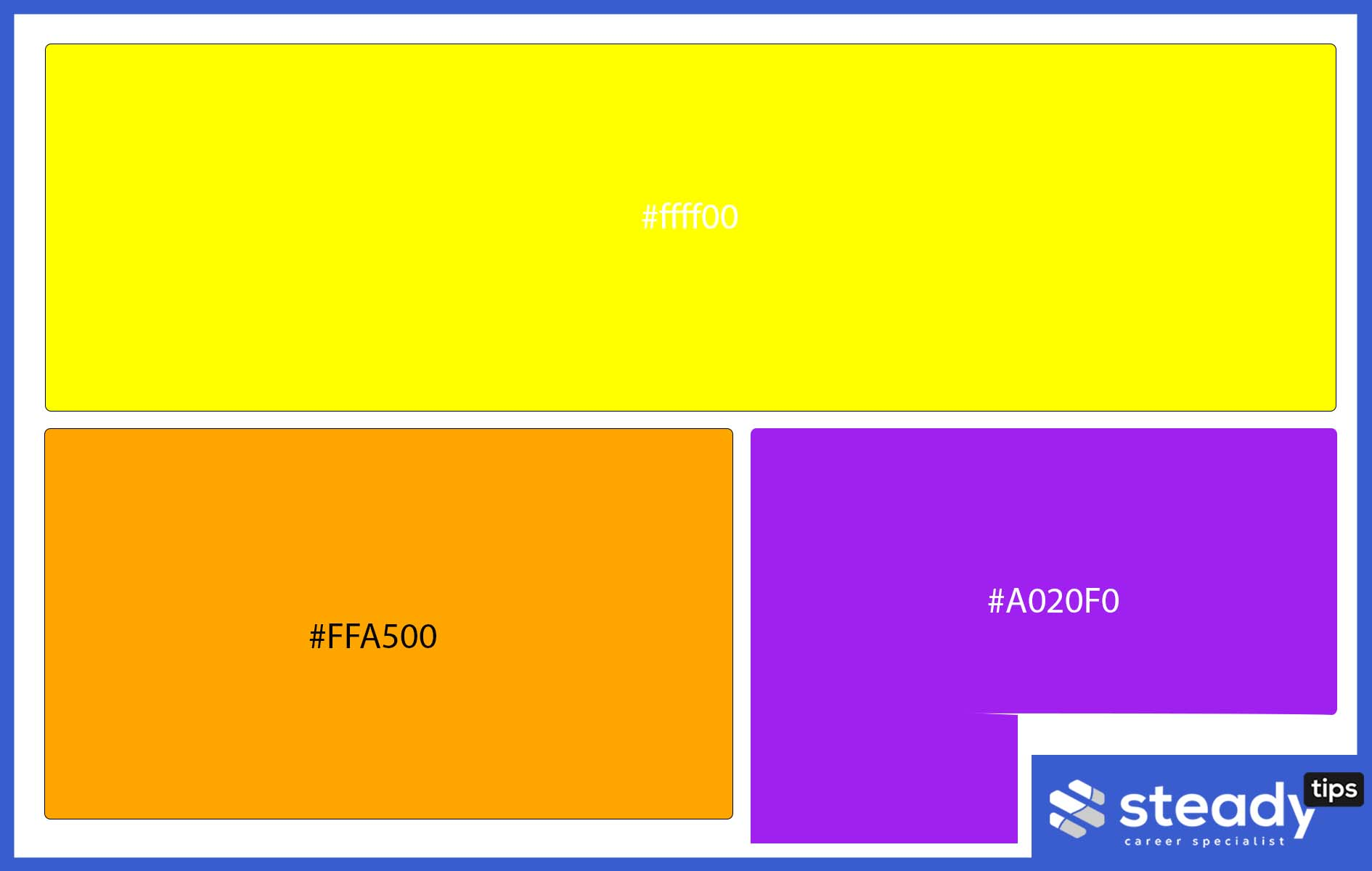
Orange, in this combination, is a warm and energetic color that stimulates creativity and productivity. It will significantly impact the social lives of those living in that house.
Purple, in this case, gives this rich and luxurious feeling to the home. Talk about a touch of royalty. That is what the colors purples, royal blue, and gold usually stand for.
Yellow gives a cheer to your home. That’s something everyone would definitely want.
Burnt Orange + Emerald Green + Warm White
The various shades of orange can have different functions in a house setting. A burnt orange couch, Emerald green plant decorations, and warm white walls are a combination that can set your home setting or living room on the path to luxury.
I personally love the Emerald green and burnt orange combination because it speaks luxury and a little bit of royalty if you ask me. Makes your living room feel different.
Orange + Copper
Copper and orange décor speak of uniqueness and luxury. I’d always like a copper or orange picture frame. The orange color scheme in any setting gives it that bright feel, basically lighting up your space with a touch of royalty.
Orange lights as a chandelier won’t be a bad idea. It will help to give you a more royal look for your living room. I personally love orange lights in the dining room.
Wood Tones and Orange
Do you want to give that retro vibe from simple accent colors? The Wood tones and orange may just be the perfect accent colors for you to try out. That wooden brown can be mixed in with a wallpaper to set up your TV stand, and the orange accent color can give the undertone.
Orange walls and will always work with white and a wood-toned floor.
Chocolate Brown and Orange
A soft orange wall, can go with a chocolate brown couch. This combination will also welcome any vase that can go with orange. The soft orange walls will definitely always go with any shade of brown on your couch.
Pale Color Orange + Olive Green
Like I always say, go for orange accent pieces when in doubt. Items like accent pillows on your couch will always make your place unique. Vibrant shades of olive green will also give that bold contrast to your set u.
Fuchsia and Orange
A fuchsia-mixed wallpaper will go with orange on any object, including picture frames, walls, and more. A similar color scheme has been discussed.
You can a soothing orange décor with accent pillows to spice things up.
How to Choose an Orange Bedroom Color Scheme
We have several rich shades of orange, proving that orange is a versatile color that is useful for an orange sectional design and creates a unique feel in your home.
Don’t just throw pillows randomly, throw pillows at specific target; in other words, ensure that you plan your home correctly.
The Key to selecting the right orange color setup for your bedroom, lies in the walls, and the sheets. The floor at this point is completely off-limits.
Afterward, pick one of these orange combinations. We have outlined some of the bests colors to go with orange.
Complementary Color to Orange
There are several complementary colors to go with orange. Some are
- Blue and orange
- Grey and orange
- Purple and orange
- Pink and orange
- Black and orange
- Chartreuse and orange
- Electric Ultramarine and orange
Adding Colors from the color wheel to a Neutral Room
Some people that black isn’t a color, rather, it is the absence of color. If you are part of that school of thought, then this might not be for you.
For the purpose of this article, I’ll like to view black as a neutral color, and white as the second neutral color.
There is no specified rule for adding colors to neutral colors. This is mainly because these colors go with almost any other color.
Creating an Orange Accent Wall
With these 7 steps, you can create an orange accent wall that you
Step 1 – Selection
Select the shade of orange you’d like to use. If you are not an orange fan, there are several other colors to pick from. Let me know if you’d like a proper list of these colors.
Step 2 – Preparation
The prep phase is quite important. Ensure you scrape off any wallpaper on the wall, and fill up any hole that could be found on the wall with any material of your choice, or by visiting that helpful post embedded within this paragraph.
Step 3 – Get your paint buckets and Materials ready.
You can either order your own paints online, or get to any shop that deals with paint and painting materials. You might need to get various sizes of brushes to ensure you are covered regardless of the tight spots you’d need to paint on.
Step 4 – Protect non-target surfaces.
You wouldn’t want the tile areas to get spilled paint or anything of the sort. So, it is best if use a tape or old newspapers or anything you can readily lay your hand on.
Step 5 – Go ahead
It’s time for you to get on with your painting business.
Step 6 – Remove protections
Remember those newspapers, tapes and stuffs you used to cover important areas? It’s time to remove them
Step 7 – Finishing.
You might need to inspect your work and do final finishing touches to areas that absolutely need it, otherwise, congratulations on your new accent wall.
What does Bright orange do for the overall feel of the home?
Bright orange is one color that can raise the cheer levels in your home, and helps bring that colorful touch that everyone would definitely like.
Orange also helps children develop sharper minds. Note that this only works with bright orange colors and not dark ones.
Orange also brings some level of royalty to your home. I personally love it.
Summary
Orange is a fun and exciting color anyone can use to get the desired result. Are you searching for more home improvement tips? If yes, then bookmark steadytips.com to get the best to get more of our tips and tricks articles, that can help you transform your houses into something exciting.